Influenza infections

Hospital admissions with confirmed influenza 9th February 2022 highlight the seasonal trends. 

Graph 2: Hospital admissions with confirmed influenza 9th February 2022

Image

A line graph showing weekly hospital admission rates per 100,000 population for influenza-like illness in England and the North East from week 40 of 2019 to week 38 of 2023. The y-axis ranges from 0 to over 20, and the x-axis shows ISO weeks. Different colored bands indicate baseline, low, medium, high, and very high admission rates. The North East region's rates for 2022-23 are significantly higher compared to other periods.

Graph 3 ICU/HDU admissions with confirmed influenza with MEM thresholds SARI Watch (Mandatory Surveillance) 9th February

Image
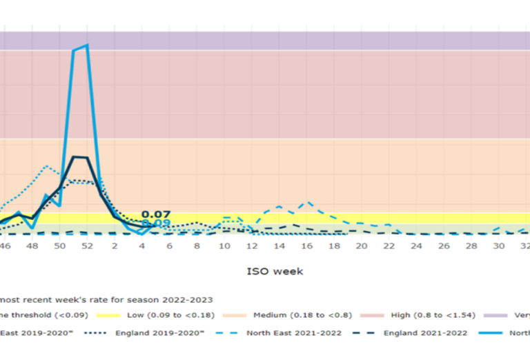
A line graph showing admission rates per 100,000 population over ISO weeks for different seasons from 2019 to 2023 in North East England. The y-axis ranges from 0 to 1.50, and the x-axis shows ISO week numbers from week 40 to week 38. Different lines represent seasons: 2022-2023, 2021-2022, and 2019-2020. The background is color-coded into risk levels: low, medium, high, and very high